Brand identity · Packaging · Content system
GRIPPY — From product concept to a complete brand identity.
A friendly, responsible identity for an anti-slip gel: a rounded wordmark, a soft palette, an expressive mascot, packaging and a content system that speaks Portuguese, Spanish and English.
- Disciplines
- Brand identity, packaging, content
- Languages
- Portuguese, Spanish, English
- Deliverables
- Identity, mascot, carton, social templates
- Note
- Mockups are concept visuals
01
The brief and audience
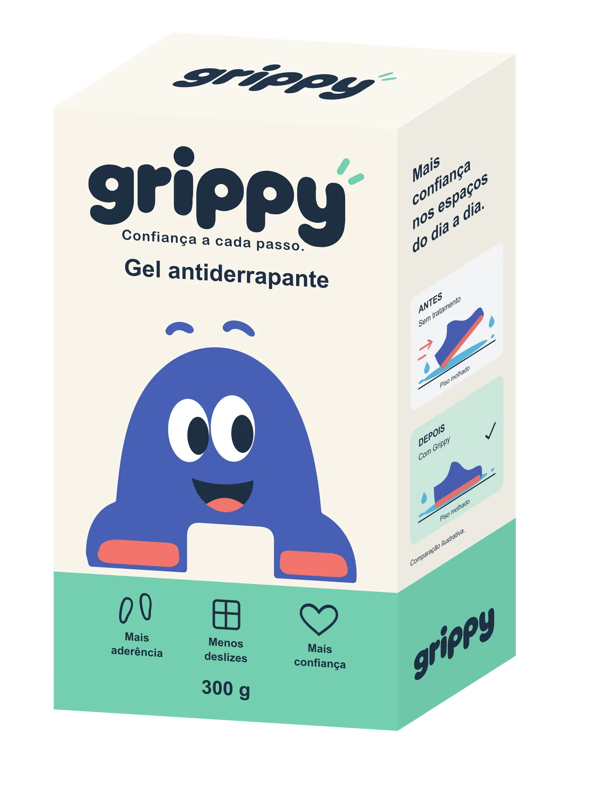
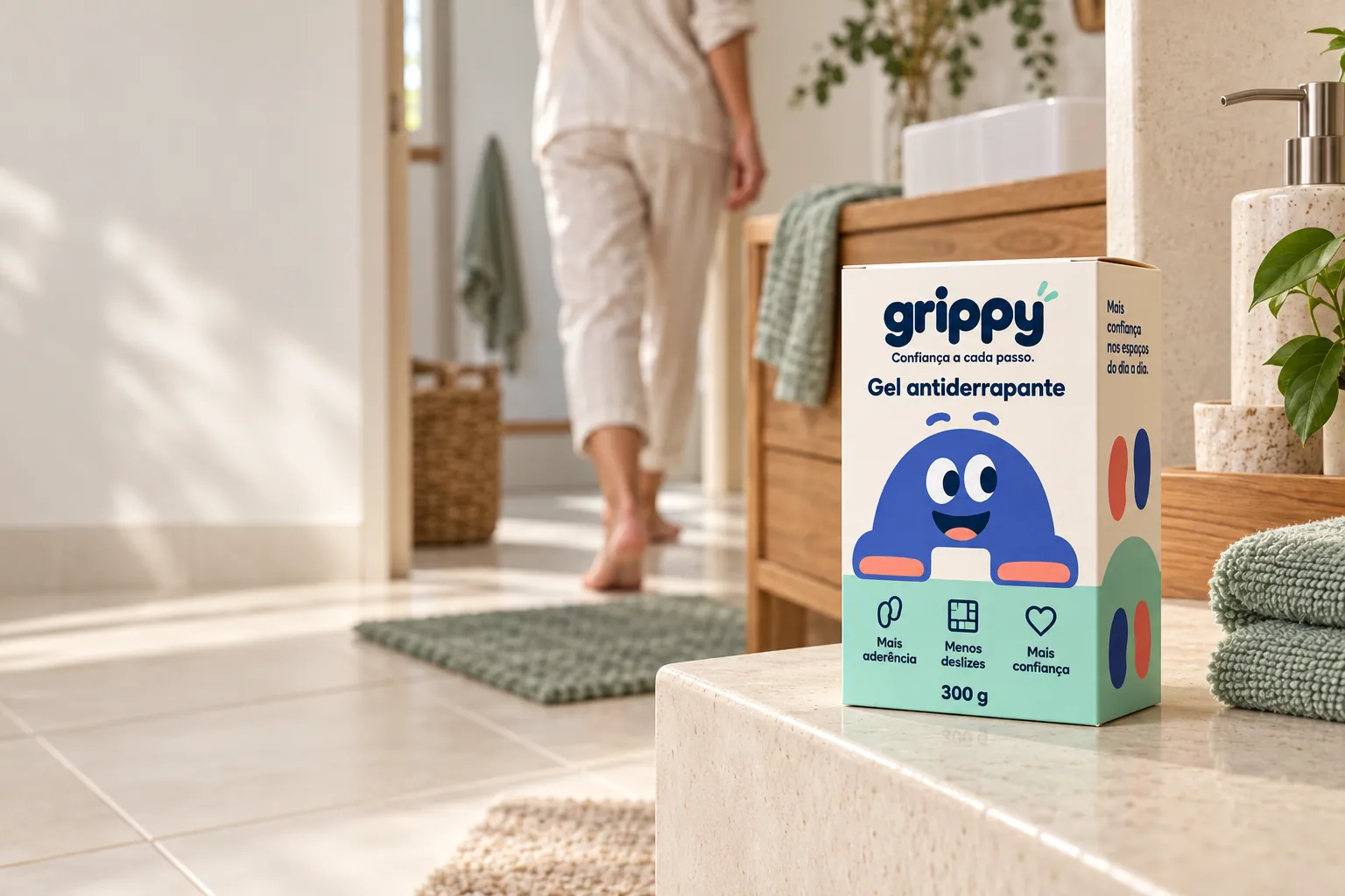
GRIPPY is an anti-slip gel for compatible ceramic, stone and mineral surfaces. The brand needed to feel friendly and reassuring without dramatising falls or making promises the product documentation doesn’t support.
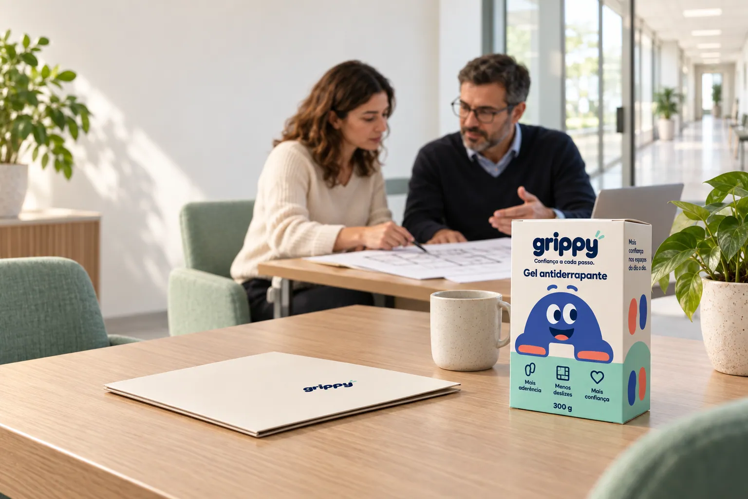
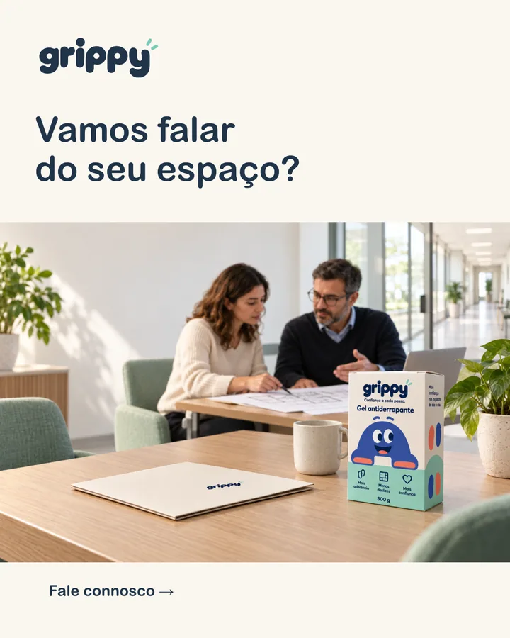
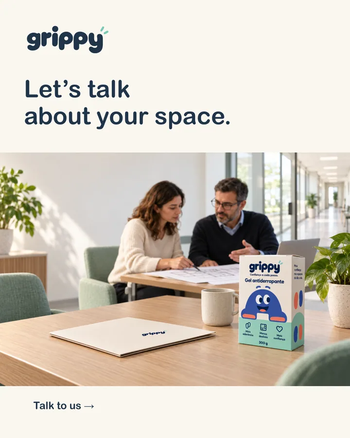
It speaks to two audiences: people looking after their own homes, and the teams who look after shared spaces — so the same identity has to work on a bathroom shelf and in a meeting with a facilities team, in Portuguese, Spanish and English.
02
Visual identity
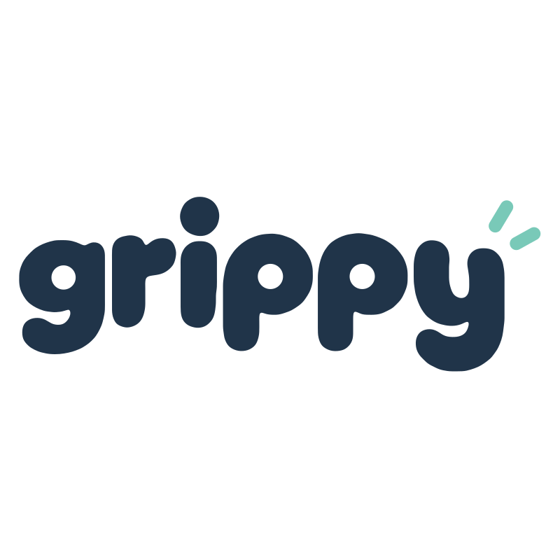
A rounded lowercase wordmark and a soft palette of navy, mint, blue and coral on ivory. Navy carries text and the logo, mint and ivory set the backgrounds, and coral is kept for small details, like the mascot’s soles.
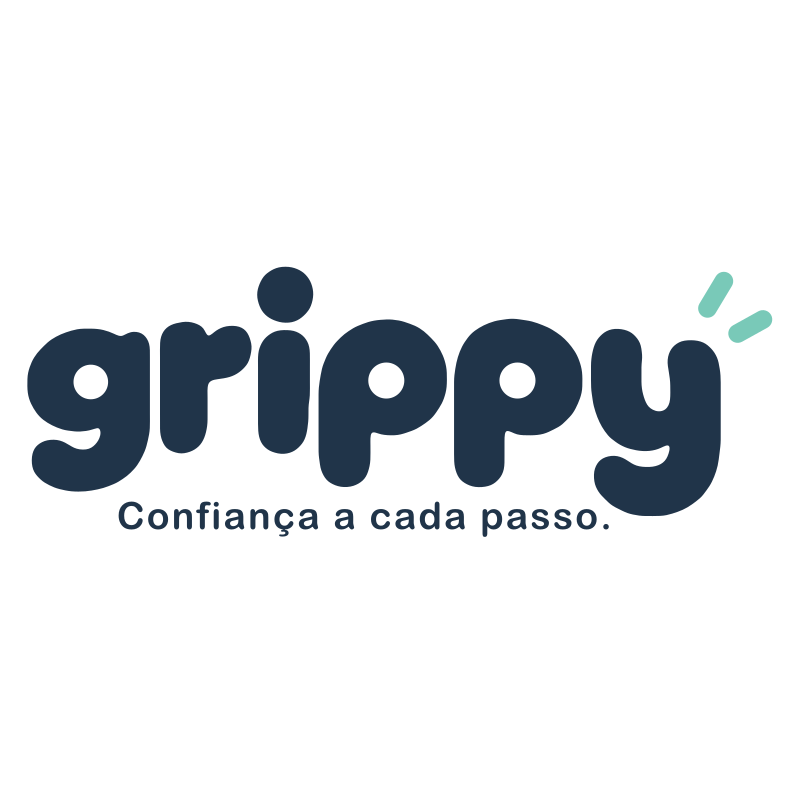

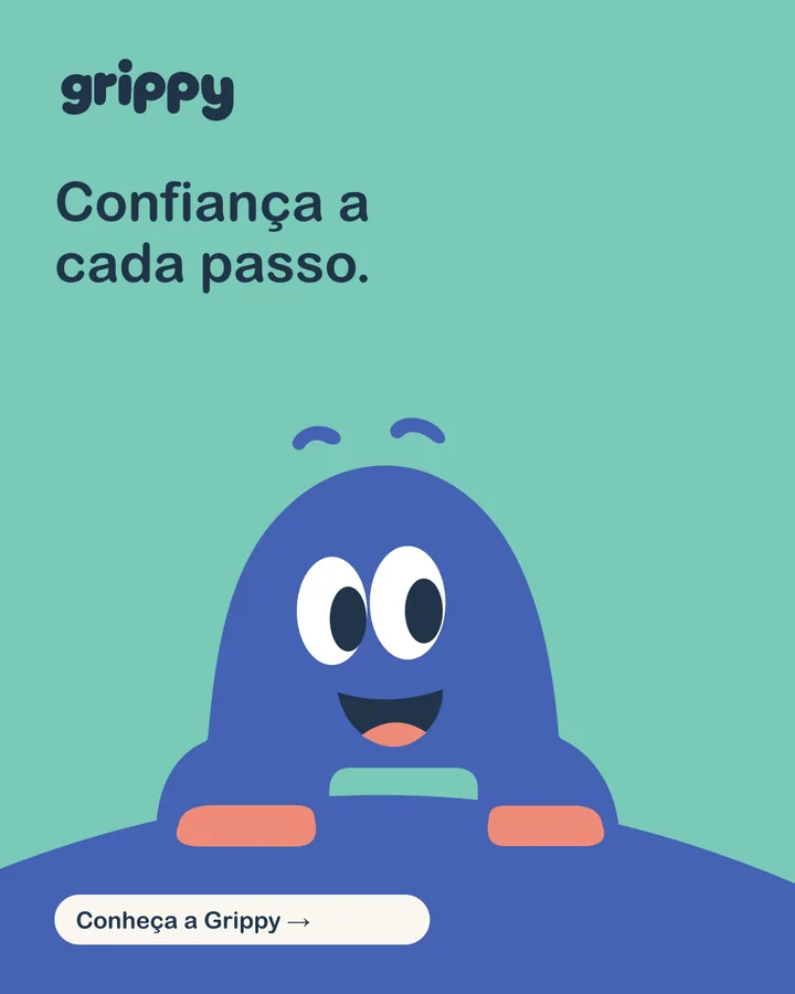
Confiança a cada passo.
Headlines · Arial Rounded MT BoldClear, direct sentences with one idea per message and one main call to action.
Body text · Arial


Pattern, stickers and website graphics designed as supporting elements for digital use.
03
A mascot with a range of expressions

Main expression
The official open smile, used on the packaging and as the brand’s default face.
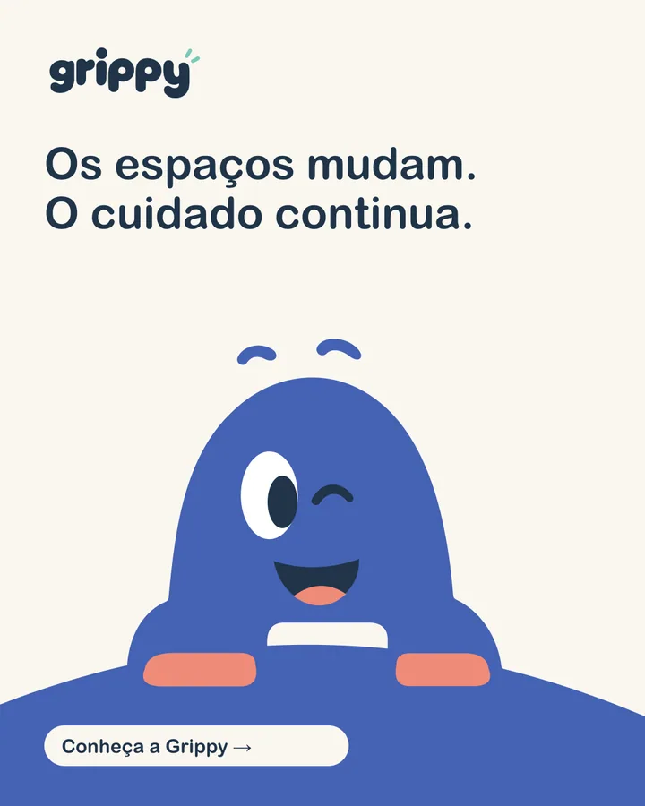
Wink
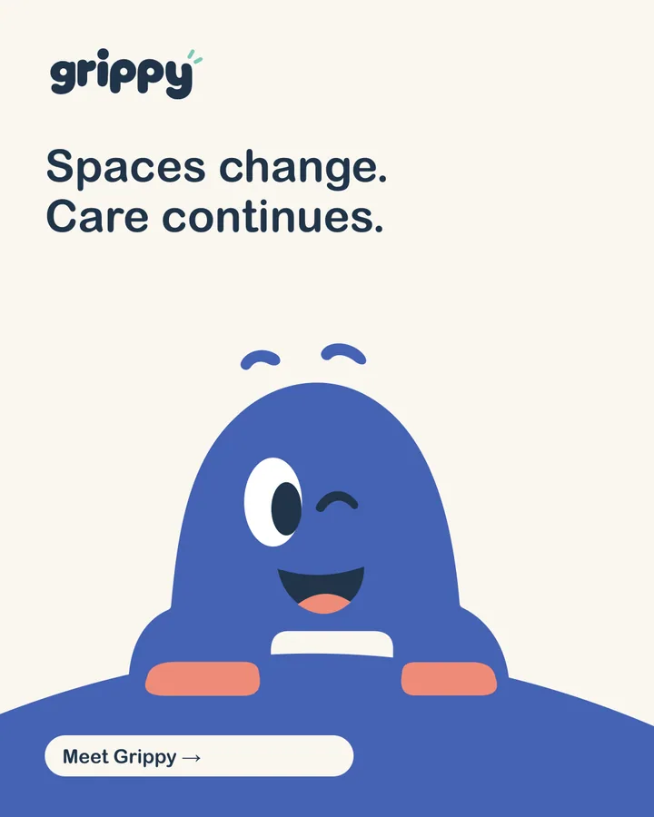
A playful aside for social content and lighter moments.
Joy
Eyes closed in a smile — warmth without exaggeration.
Curiosity
A tilted pose for questions, tips and invitations to find out more.
Attention
A calmer, focused face for information that needs care.
All five expressions are drawn from the same outlines, so the character stays consistent wherever it appears.
04
Packaging
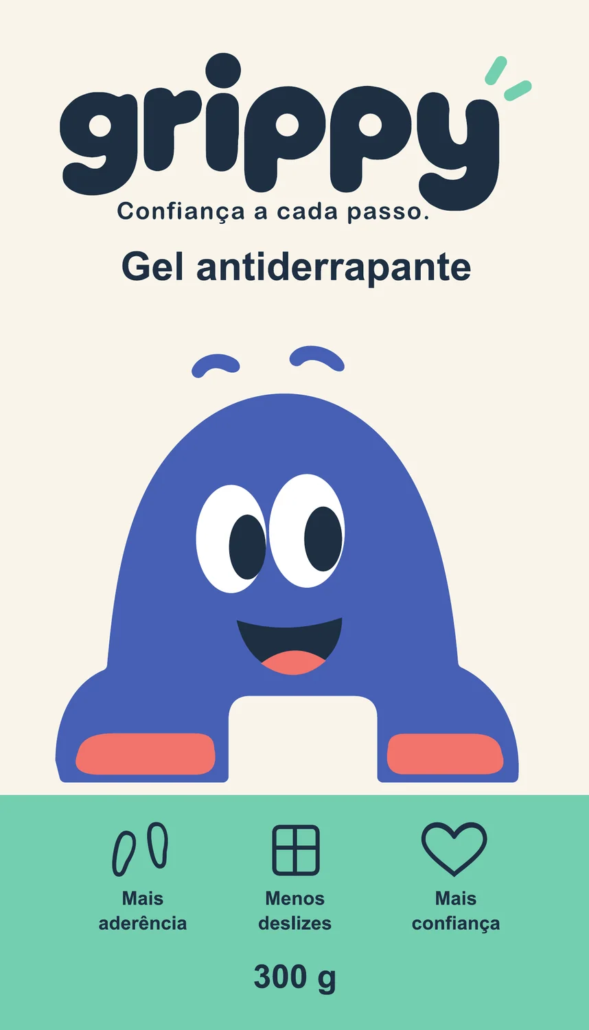
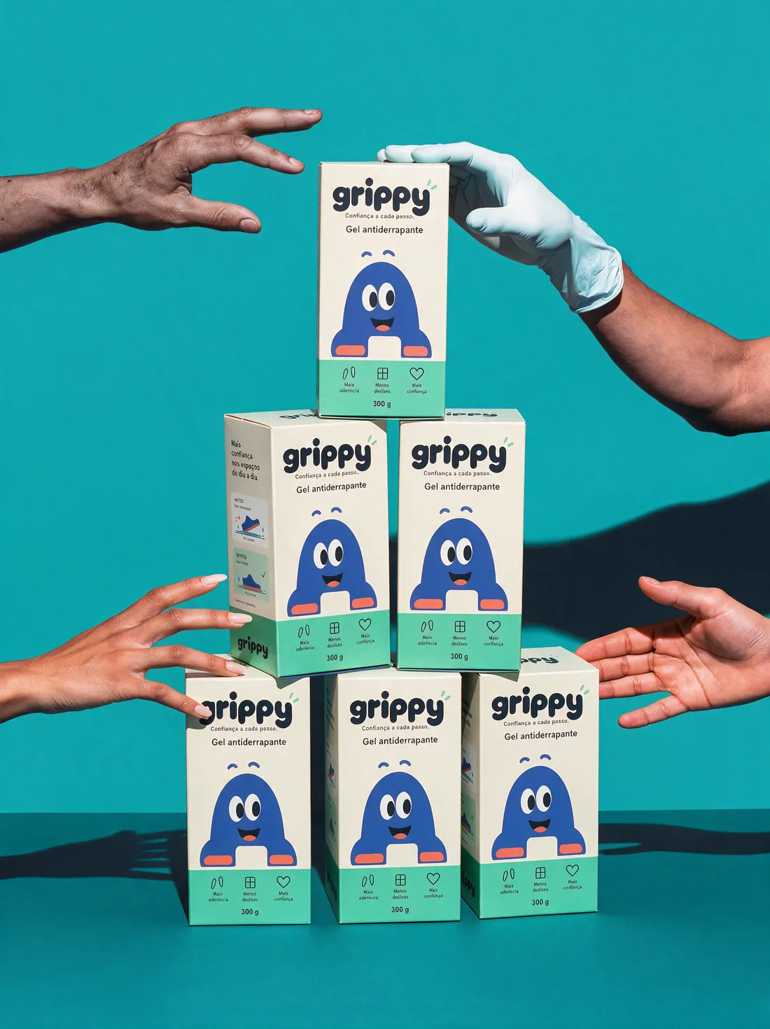
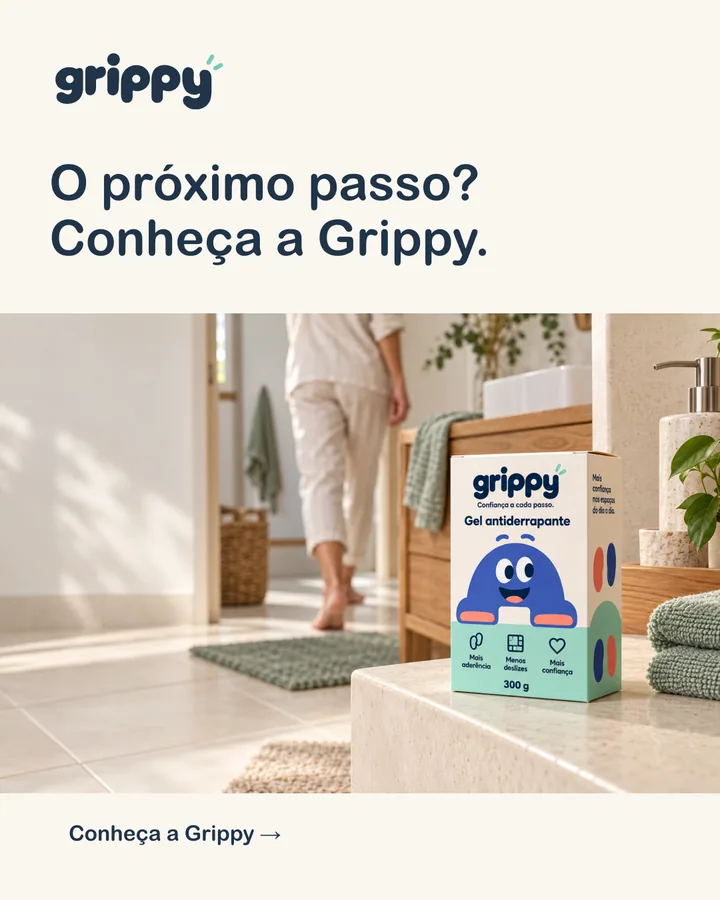
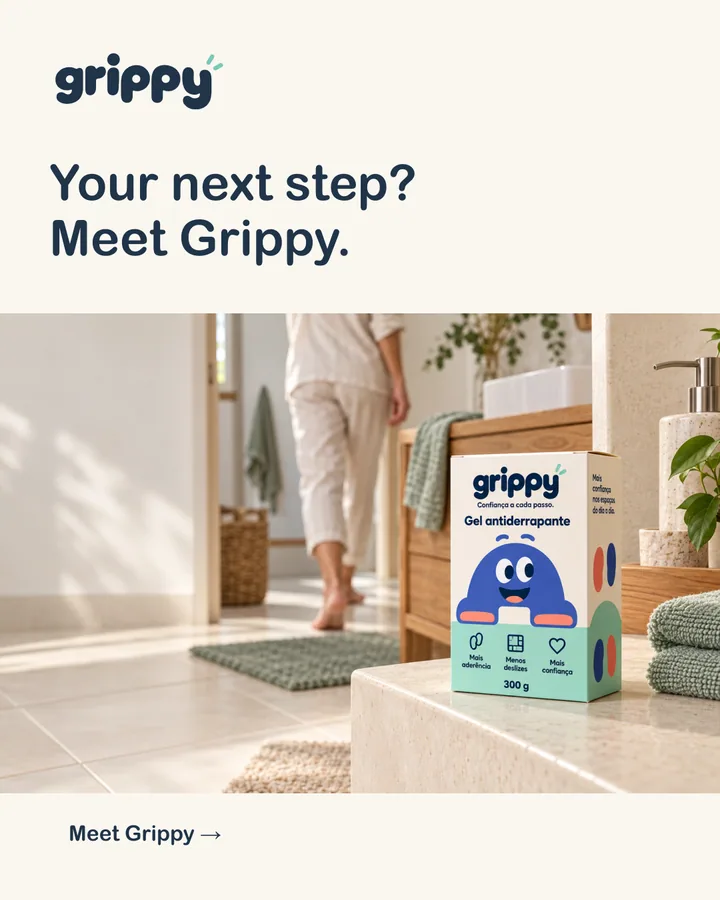
The carton puts the mascot at the centre and keeps the information simple: the product name, three icons and the weight. It was designed for a 300 g box measuring 120 × 60 × 210 mm.
05
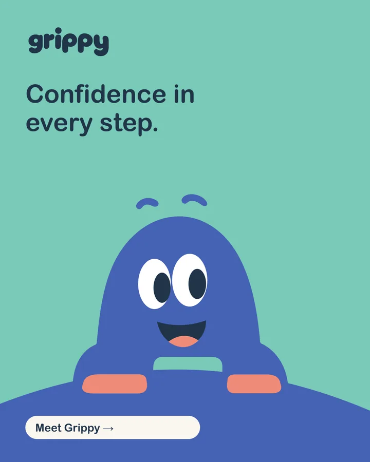
Social and digital applications
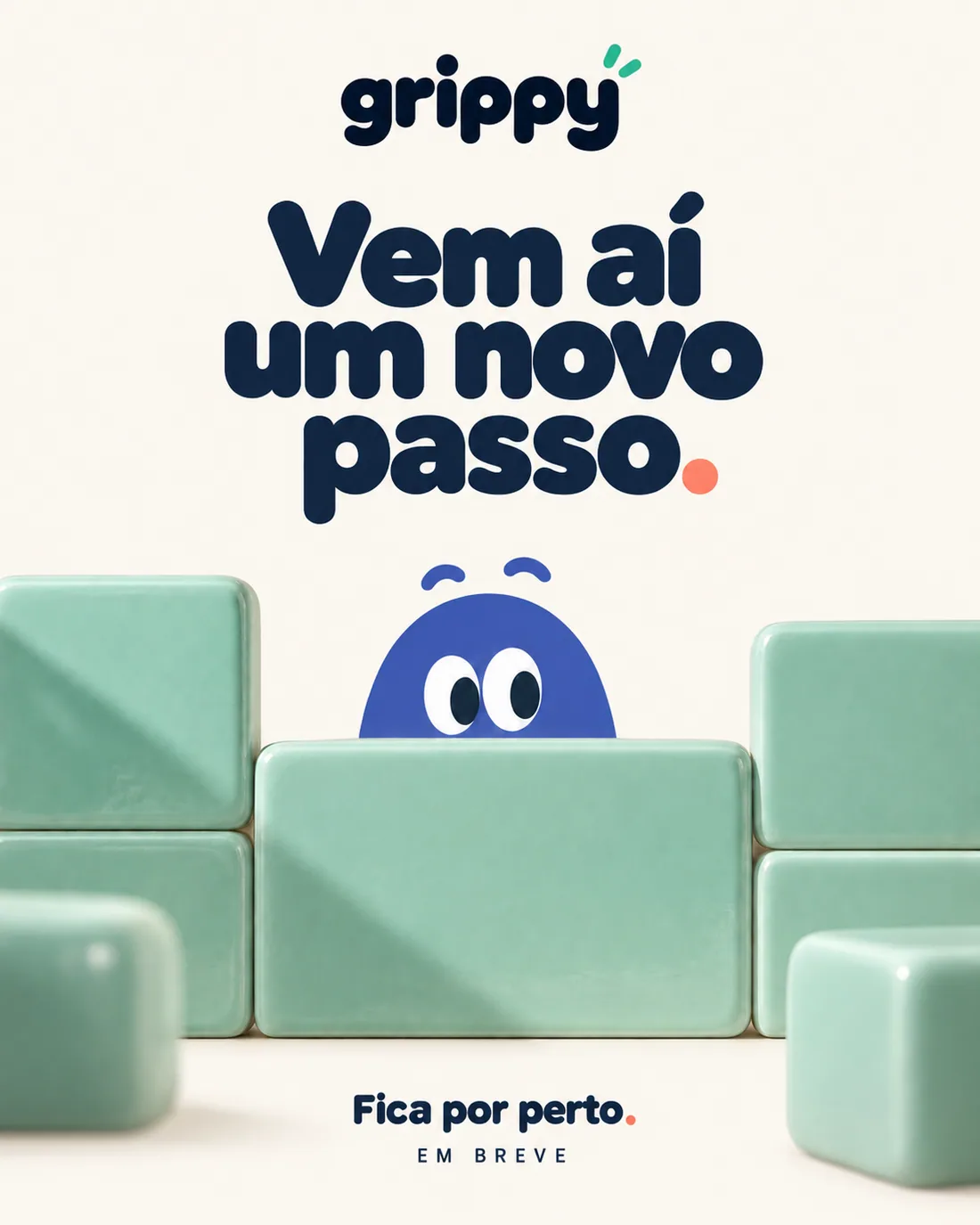
06
Multilingual communication
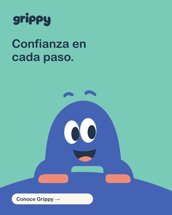
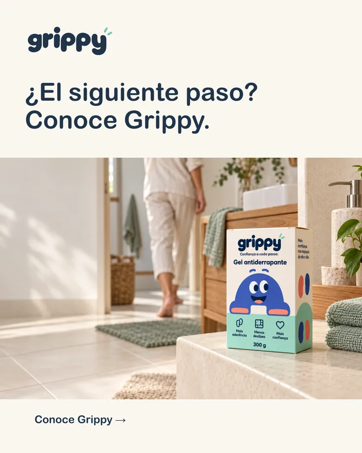
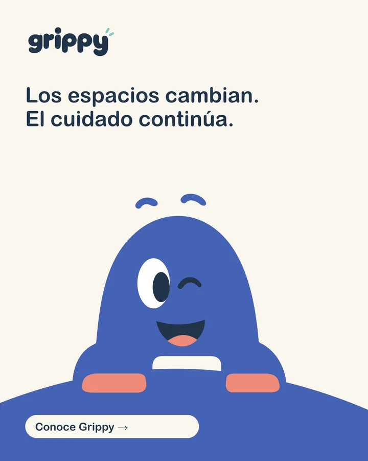
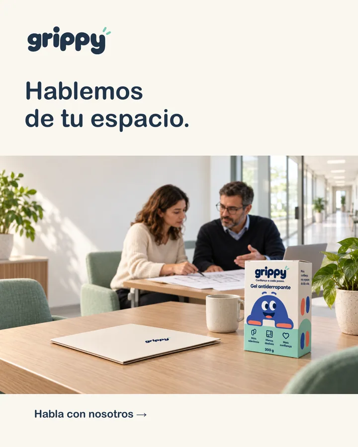
PT-PT
Cordial and direct — “Fale connosco”, “casa de banho”, “equipa”.
Confiança a cada passo.
ES-ES
Natural and close, using “tú”; it can shift to “usted” for institutional proposals.
Confianza en cada paso.
EN
Simple international English, without regionalisms or forced literal translations.
Confidence in every step.
Each language has the same six templates — four posts and two stories — so a campaign can run in parallel across markets while still sounding natural in each one.
07
Deliverables
- Logo and variations (with and without tagline, navy, white)
- Colour palette with RGB and CMYK values
- Mascot with five expressions
- Carton design and benefit icons
- Six social templates in each of PT, ES and EN
- Tone-of-voice guide and message bank in three languages
- Tile patterns, stickers and website graphics
- Concept mockups for home and professional contexts